OTTICA GALLERY - 1ST EPISODE


As reviewed on Azure magazine:
“The inspiration for the small optical store named Ottica Gallery began with the site: a retail space within the Piazza Castello, one of Turin’s major historic arcades. The design firm’s first strategy was to brighten the storefront with bursts of colour to highlight the eyewear. They settled on using red, blue and green polyurethane boxes as pedestals, a detail that was inspired by the brightly hued sculptures of American minimalist artist John McCracken.
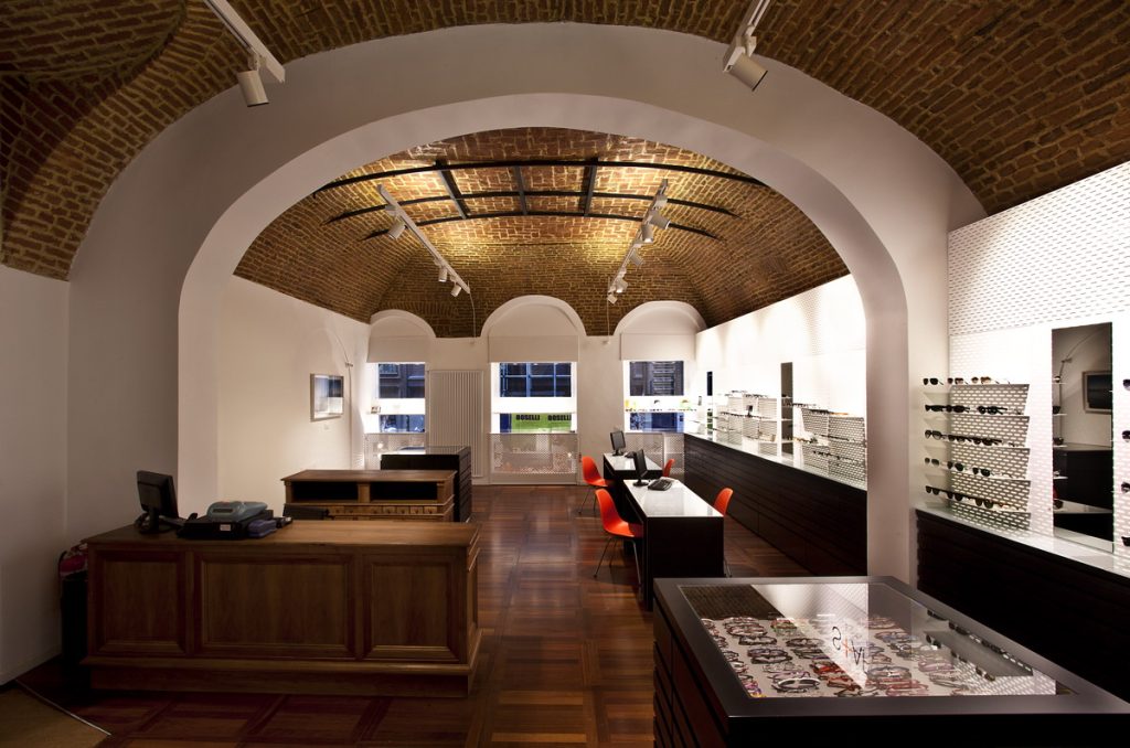
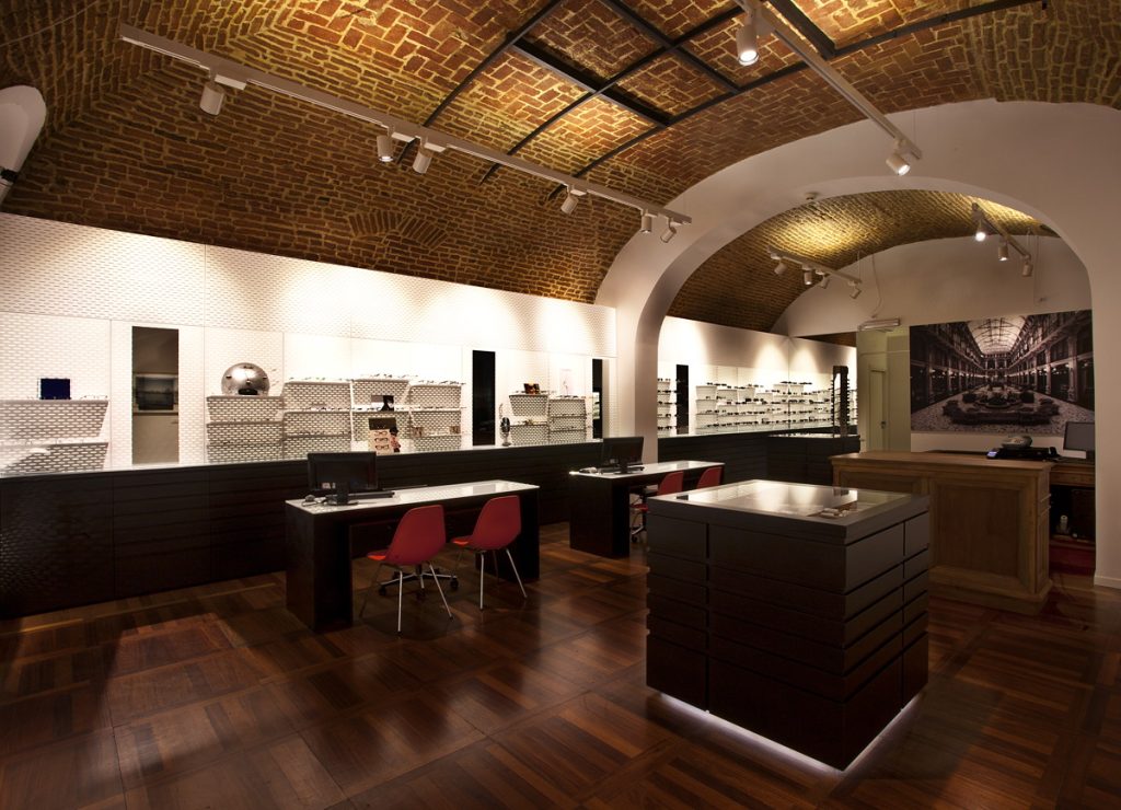
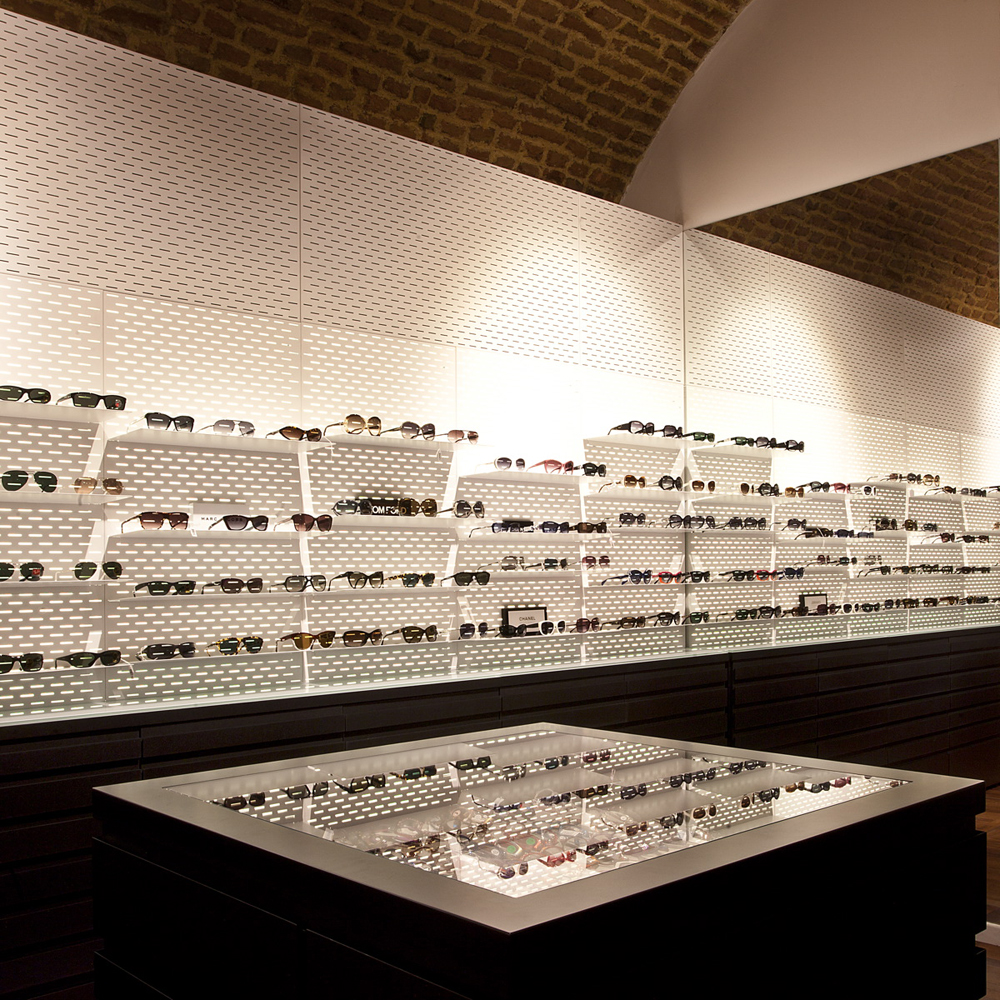
Inside, the shop is illuminated with tracklighting installed on the barrel-vaulted ceiling. There are only a few pieces of furniture within the space, including custom tables and drawers in black-lacquered MDF with glass display tops, and wood-panel desks that complement the hardwood flooring.
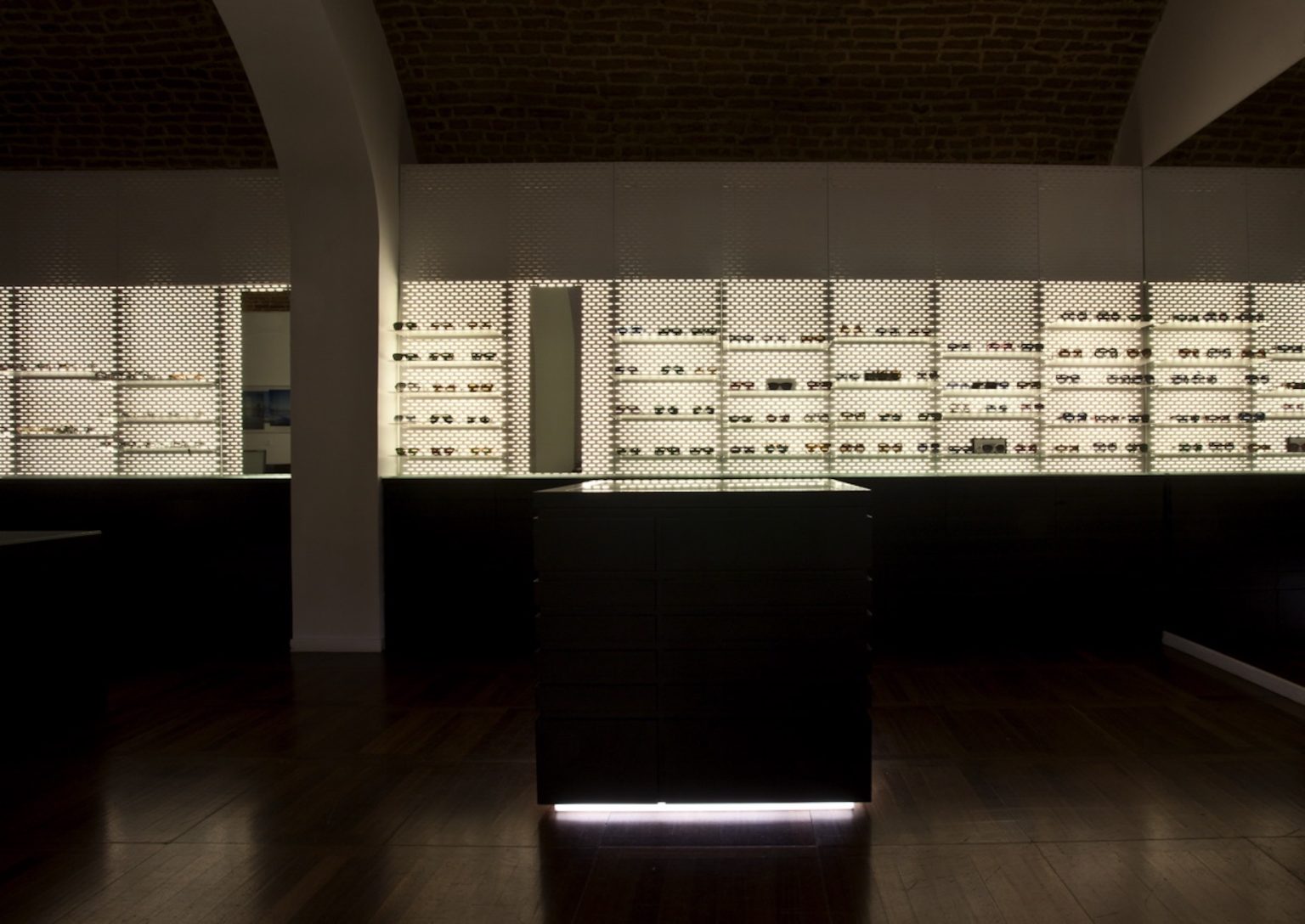
PAT Design kept most of original interior features, but brought things up-to-date by adding a few key contemporary elements, most notably, prestine white metal shelving that hang along one wall. Backlit, these punctured surfaces cast delicately stippled shadows that echo the grid-like pattern of the brick ceiling. Bright orange occasional chairs add a dash of colour, another ode to McCracken”.